Basic 7
Lesson 1:
Tallies
Lesson 2:
Frequency Tables
Lesson 3:
Pie Chart
Lesson 4:
Double Bar Graphs
Frequency Tables
In our previous lesson, we learnt how to use tallies to make records of various occurrences in a raw data.
We used vertical marks to represent each occurrence in the raw data.
In this lesson, we will learn about how to organise those tally records into a frequency table, also known as a frequency distribution.
Frequency implies the number of times a particular record appears in a raw data.
Consider the example below:
The data below shows the marks obtained by a class in a Mathematics test.
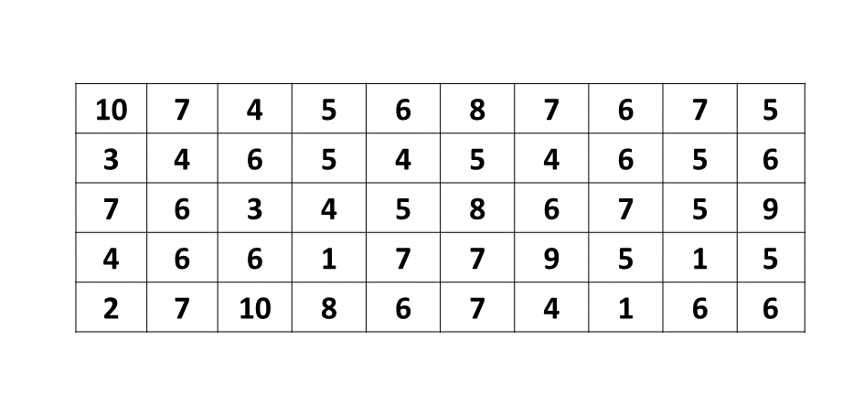
We can use tallies to organise the raw data above into a table to know how often each mark appears.
Ungrouped Frequency Distribution
We follow the same process of recording data using tallies as learnt in the previous lesson and write the corresponding numerical value in the frequency column.
In the table below, we have used tallies to organise the raw data above into a frequency table:
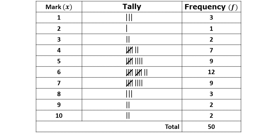
The table above is called an ungrouped frequency distribution as it shows only a list of values in the data presented above.
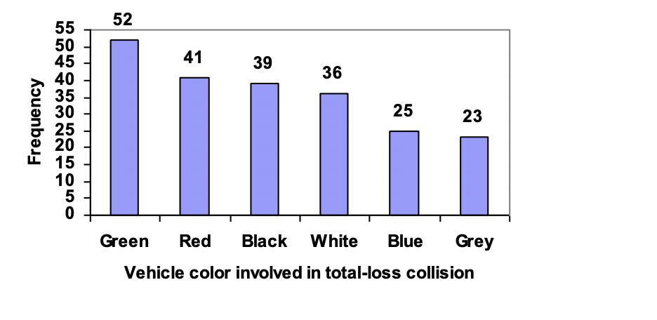
Bar Graph
Once the data has been arranged in a frequency table as done above, we can then represent the distribution in a bar graph.
A bar graph (also known as a bar chart) is a visual representation of data using rectangular bars.
These bars can be vertical or horizontal, and their lengths (or heights) are proportional to the values they represent (their frequency).
Bar graphs are commonly used to compare quantities across different categories, they make it easier to analyze and interpret data visually.
Below is an example of a bar graph:
Features of a Bar Graph
-
Bars:
\(*\) Each bar represents a category.
\(*\) The length or height of the bar indicates the value of the data for that category.
-
Axes:
\(*\)Horizontal Axis (\(x\)-axis): Represents the categories (e.g., marks, months, products, or groups).
\(*\)Vertical Axis (\(y\)-axis): Represents the values (e.g., sales, frequencies, or percentages).
-
Spacing:
\(*\)Bars are usually spaced evenly for clarity.
-
Labels:
\(*\)Axes are labeled to indicate what the categories and values represent.
\(*\)Bars may have labels or legends for additional information.